When talking to people on Last FM, an online music site, my parter came across someone who knew of the band, and passed on a link. This is a video recorded by a fan at a recent Scarlet Pills gig, 2 minutes in they begin playing their song "Headlights" which we are using for our project. This is a useful video as it can give us insight into dress sense, and stage movement for the band.
Sunday, 26 December 2010

Friday, 24 December 2010
Time Plan
 As the filming project began not long after Christmas, me and my partner thought it best to organise our shoots as soon as possible setting; dates, times and locations to everyone involved ensuring they were available. We also set two backup dates to reduce any stress from unseen problems, and informed everyone as soon as possible, giving them plenty of time in advance. This is the e-mail I sent out to our actors and prop providers. As can be seen, I included a clear breakdown of the dates, times and locations as well as including a brief summary of the goals and who/what would be required. At the bottom I also included a short note on dress code, making sure that everything was covered and as close to our ideals as possible. In addition to this e-mail, I sent two other e-mails to both the music shop locations outlining our proposed logistics, and also our stage/performance area since these two locations were not accessible via facebook.
- On the first day back at college we have planned to do the music shop scene, only three of the actors will be in this scene. As this is a tuesday i finish college early and we have organised with our actors about when their frees are as to not disturn lessons. We plan to do this either between 11:30/13:50, 12:50/13:50 or 12:50/15:10.
- The 5th will be when we film the performance aspect of our music video. This will take place on the stage of a school. This will be from 16:00/18:00.
- On the 7th, we are planning to do the bedroom scene, where our singer will be an angsty teenager and throw stuff about. This will be in Kidderminster, so we have taken into account journey times and when lessons end. Hopefully, this will be between 3:00 till 4:00
- The 8th will hopefully be our final filming day. These scenes will be where the singer is walking around the suburbs and where all performers are hanging around indoors. Times are unknown.
- We have left days free for possible need to reschedule, those are on the 12th and 15th leaving plenty of time just in case things don't go as planned.
Thursday, 23 December 2010
Test Videos
Here I have begun testing methods and cutting in preparation for my video work. As I don't have a video camera or video editing software, I had to use my phone camera, and when the cut was required, to pause the recording and resume when required. These first two videos are to practise the door cuts, where one member walks from one room to another through a door. This is a method that will be used three or four times in the video, and so must be perfected and realistic. The first out of the two videos is meant for when the band leaves the living room and goes to the music shop. This is different to the standard room to room cuts because the camera begins at a very low angle, focusing on a foreground object. This could have been a tricky shot due to the change in angles from one scene to the other although I feel it worked well.
This next test is a standard version of the room to room cut, using the same camera angle and height through both scenes. Again I feel this practise video worked well, creating a realistic and smooth cut even without in depth editing.
Here I attempted the head rotation cut, where the camera revolves around the head, and the cut takes place when the screen is covered by the back of their head. Although this worked very well in both practice and theory, the simplicity of my equipment let me down. As the lighting was different outside than inside, the shade on the back of the head differed creating a clear and not seamless cut. The other problem was that my speeds on revolution did not match, therefore seemed jerky and again, not smooth and seamless. With the correct editing software and camera I believe this will be a successful transition.
Location
 While at one of my locations I took a panoramic video to give a better idea of dimensions, room layout and general style. This will be an ideal location for the living room scenes, with the band on the sofa and chair, the tv in the corner to watch (there will only be one TV at the time) and the door on the other side of the room to exit through. To accompany this location video I have various photographs to give a bit more detail.

 This is another of the locations for the music video, playing the part of the street scenes, where the singer walks and finds the hit and run victim. This location is idea, since it is the dead end of an estate style road so there will be little traffic, and it is beside one of my friends houses, this allows us to use their mains for the lighting kit. Despite this, an unavoidable problem which immediately comes to light under current circumstances is the unexpected arrival of snow, which is likely to stick around till after our filming deadline.
Friday, 17 December 2010
Digipak, Advert & CD's


This is my latest version of the digipak design containing all my own photos and the same proposed layout as my mock up version due to its success. As can be seen, it is a fairly striking cover through the vibrant perspective lights, while maintaining an atmosphere of grunge and darkness. This in essence sums up their genre of punk/pop/rock quite well by the contrasting combinations of these vibrant to dark colour schemes. Because of the perspective lines of light on the cover, I kept the layout as balanced and central as possible to keep it aesthetically pleasing. Within the cover and reverse layout I ensured I included key information such as disclaimers, the fact it is contains bonus DVD footage and other law required information. These lines continued on the reverse of the CD, although this time I decided the layout must be justified left, in order for the image to be clear. This image has a direct correlation with the front image, as if we are looking at the same scene through two varying perspectives.
On the inside, I kept the house theme of the vibrant lights, and the generally black/white colour scheme. On the inside left panel, I thought it important to include a band image due to this being their début album, and to differ it from the styles on the other panels. In this band image (construction process is explained under "photo shoot" post) I kept the members close together, and to a relatively restricted colour scheme. This was so they fitted easily within the style and to allow the lyrics of the featured track to be written beside them. Because the band image does not have a background too it, but sits on the miscellaneous backdrop, I blended them in with a set of swooping headlights twisting around them. This adds depth to the image and continues the "headlights" theme. Across both of these inside panels, I also used one headlight blur image as suggested in my feedback. This I feel works extremely well and adds a striking element to the design.
 The next element of the digipak design was the CD vinyl. For these I decided having two separate CD's would be better suited; one audio, one DVD. On these disks, I again maintained a common theme of black, white, and a slow shutter speed image of headlights. To differentiate these two disks I altered the design slightly, to correspond with its function a little more. For the audio disk, I used the basic headlights image, and superimposed a mid close up composite band pose. This signifies it is the band itself, and thus the entire album as supposed to just the bonus footage. To merge these two images together in a slightly more realistic way I added a lens flare on the left hand side, where the brightest part of the headlights were. The DVD disk though, was more focused around the featured track and music video "Headlights". To compensate for this I added more lights in a scarlet shade, thus resembling both the band "SCARLET pills" and the track "Headlights". These designs also incorporate the same positioning of law required information, band logo and disk title, number and listing. Overall these simplistic designs fit extremely well with the digipak design and work well to their given function too.
 Finally I had to design a magazine advert for the band and their digipak release. Although I did not use the images from the digipak cover, or include an image of the overall cover, this I feel correlates to the product extremely well. The main points of connection between the advert and product, is the colour scheme of black with insert of vibrant blurred lights, use of bold, upper case distorted font and the constant use of the band logo. Within the digipak design, I was careful to include the band logo in bold yet non distracting ways on every panel. This was to tie the advert and product together, and more importantly because they are an upcoming band, thus should be recognised for name not the single digipak cover. The layout to this design is split into three aspects; two halves split down the middle, and a bottom strip banner. The bottom banner in this design is to hold the reviews for the product in a clear manner, while the two halves were more focused on imagery. The left half contains another band image, slightly different from that within the digipak layout, this image is important as it connects the audience with the artist, while the right side boldly displays the band logo, album title, release date and that it is a special edition. To draw more attention to these I have stuck with the font colour theme of white and yellow in a block capital distorted font, and edited them into a suitable yet bold perspective to capture the audiences attention. In the bottom left hand corner of this advert I made sure I included the places where the audience could obtain the product.
 As an extra piece, I also mocked up these elements into a package, as if on display. This enabled me to view them as if they were in production. Overall I feel this is a very strong set and work together well, corresponding with each other clearly.
Friday, 10 December 2010
Research & Planning - Production Process
In constructing my digipak, I had to go through several processes to manipulate my images and perfect the design. To begin with I looked at the photo shoots for the band members and began creating my band image, as this was required for the digipak and advert.
 The first stage in this was to find a specific photo I liked, and then cut it out using whatever tool is to preference. For me, the polygonal lasso is best as it gives controlled usage rather than the normal lasso which depends on how steady your mouse control is, and the magnetic lasso which is suitable for beginners but can be problematic when achieving the best quality. I also avoided using the magic wand despite my plain background as it too can lead to a rough edge, and also avoided using the rubber tool as some people do due to its high time consumption and awkward usage.
 After this, I inverted the selection field and feathered the edge to compensate for pixely boarders and to aid in blending, I then went through the brightness, contrast, hue, saturation and lightness to improve the colour quality and create a range of deeper, richer tones. This was to give the image a slightly glossy look, in mirroring with the headlight blur images and the plain black modern background. When the settings were ideal, I saturated the image slightly so that there was a definite mix between the glossy style, and a slightly more grungy atmosphere, again to be more in keeping with the target audience. These processes were also applied to the slow shutter speed images of the car lights, and resulted in an equally professional and suitable image.
  Next, I used the clone tool to remove any imperfections on the model or photo. As can be seen in the image comparison, I cleaned up his complexion and tightened up his jaw line. This air brushing technique is something that is widely used in graphic editing, creating a more desirable and distinguished model compared to the average society member. This in turn leads to a more professional finish, and takes it away from looking amateur. This process was also applied to other images which needed imperfections removing.
  Next I used the burn tool to spot contrast the images. This created the effect of lighting shadows and also brought deeper, richer colours through especially in the headlight images. After this, I repeated all previous stages on my other images, until I had a set that was ready to be compiled. In the cases of both Rich the guitarist and Hannah the lead vocalist though, I also decided to edit things such as their shirt/hoodie colour, their legs or head. These are relatively simple processes employing skills within the previous stages.
  As can be seen in this breakdown image, I achieved these changes by cutting out the element to be changed and in terms of colours; used the hue/contrast/saturation/brightness/lightness to manipulate it accordingly or added a translucent layer above to screen the image, and in terms of appendage; used the feather tool on specific edges to blend the two elements together subtly. Once this was done, they were ordered and compiled into realistic band poses, suitable for my print work designs.
 With the main aspect complete, I looked at fonts I wished to include in my design. The image here is a print screen of my font folder, not all fonts are applicable to this project. When choosing my fonts, I visited Dafont (an online font sharing site, where people can create, upload and download fonts for free) and searched for ones under suitable categories to my design style. The fonts I chose were free to use and appear successful and appropriate in my design, these were then installed into photoshop for me to use.
 Here is a breakdown image for my front cover, as can be seen it is made from various specific elements. To allow me to put the car and headlight images behind the legs while above the tarmac ground, I decided it would be best to cut the legs out. This allowed me to freely edit the legs, making them darker to allow for shadow from the headlights, without making the tarmac floor itself darker. On top of this I also added a white boarder, created by painting the trouser boarders white, feathering the insides and reducing the opacity, this created the illusion that the headlights were hitting his legs, and merged both elements of the image together. After this, I introduced shadows for the legs, from the headlights. As they were duel I understood the light would be coming from two separate directions, and thus added two different angles of shadow. Because they were translucent, the areas in which they cross would realistically be darker. Next I added the blurred headlight images. To give them infinite depth, I used both the perspective and skew tool to pull them into the distance along the same horizon/perspective line as the car, avoiding angle continuity errors. After this I added the car image, with brightened headlights thanks to the "lens flare" filer. This car image had to sit perfectly with the current horizon/perspective line and also centrally within the design, to be most effective. Due to this being a friends car, I also thought it best to remove visibility of the registration plate in respect of privacy, and so used a fading black box to cover it. for authenticity, I left a small section visible. This then left me the little jobs of adding the band logo, advisory sticker, and CD title with the notice of bonus features.
 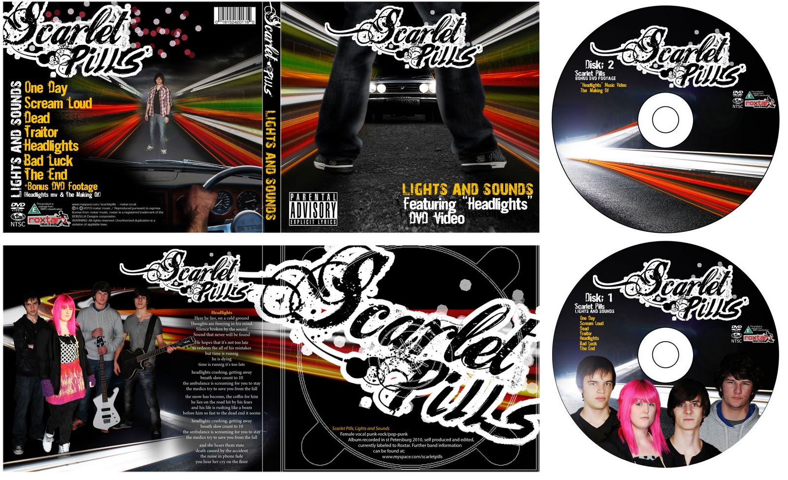 Techniques similar to these were then used to complete the following panels of the product, disks and advert. Overall I feel this resulted in an extremely professional and successful product involving a range of processes all designed to benefit the aesthetics in relation to suitability for both audience and genre.
 Wednesday, 8 December 2010
Photo Shoots
 |
| [Ross] |
 |
| [Hannah] |
 |
| [Alex] |
Hannah wore a denim jacket over the black hoodie, overall I felt the plain black hoodie suited the band style more as it reduced the colour scheme, therefore I photoshoped it to blend with the hoodie.
Hannah has a wide range of useful stances in her photoshoot, although my favourite bodily pose had a leg pose which wasn't as suitable, therefore I photoshopped a more suitable image of her legs in.
Hannah wore brightly coloured floral tights, again I thought this might have been too many colours in the image and therefore saturated them and blended them down with a semi transparent black layer.
Rich wore a black shirt originally, since Hannah and Alex were already wearing a black hoodie, I through that his shirt should be closer in colour to Ross's grey hoodie, therefore edited to a shade of grey ensuring it wasn't exactly like Ross's or it would have blended with his.
 |
| [Rich] |
Ross and Rich had some great photos, and was torn between two stances. In the end I varied them between both band poses although kept the same head for each of them since it had an idea expression.
On all members I edited the contrast, brightness, lightness, saturation and used the burn tool in areas to increase the shadowing and spot mark higher contrast areas. These changes resulted in a highly tailored and ideal set of band images.
 |
| [Band Images] |
Other Photos;
The other elements I had to photograph for my design were; the "headlights" of a car and wide stance legs for the cover, the interior of the car for the back cover, as well as a range of headlights/break light images using a slow shutter speed creating the neon line/blurred effect.

Here is a small selection of the car headlight images. As this image was meant to be a rather intimidating and threatening, I took the photos from a low angle to connote power and authority, and used my friends Stag Triumph as the model. I decided this was the best car for the job because of its vintage muscle appearance and duel rally style headlights. This turned out to be perfect and lead to an extremely effective set of images, especially when edited.

The next set of photographs was for the wide stance legs and interior, this small selection shows the main approaches I took. These photos turned out well, although in the end I photoshopped a more suitable car image in from a previous photo, and photoshopped a different hand in due to the light bleaching. I also decided for continuity it was best not to use a band member/actor as the man in front of the car, therefore put the camera on timer, and used an image of myself. Despite these changes, I was very happy with how well the photo shoot went, managing to collect a wide range of useful images in a relatively short amount of time.

My next challenge was to gather car headlight/break light images using the slow shutter setting. This was something I had never done before, and the only opportunities I had to go out were past peak road usage times. This left me with unpredictable waves of cars, yet still produced some impressive images. As shown in this selection of photos, I captured both headlights and break lights, corresponding with "Scarlet" in the band name, as well as the headlights to link with the featured track. To get these images, I visited several locations at various times to get a good selection and variation of images. I also took photos through the car windscreen when travelling to these locations, to get a more perspective based image as if the lights were all around (as required for the front and back cover). Despite this, I knew I would be able to use the perspective/skew/transform tools on photoshop to create a similar effect with my standard road images. Overall I feel these photos were extremely successful and were very good for a first attempt at the style.
Monday, 6 December 2010
Research & Planning - Preliminary Feedback
 This is some feedback given to me about my digipak mock ups, This will be taken into account when designing the revised versions. Unfortunately I wasn't able to collect much feedback through documented facebook comments due to peoples willingness, although the ones I did get have been of great use. I also followed up opinions from some people, all of which were positive and complimented the colour schemes, layout and choice in styles.
Saturday, 4 December 2010
Print Work Mock Up
 |
| [Digipak] |
This is my digipak mock up for Scarlet Pills' hypothetical album "Lights and Sounds" featuring "Headlights" and its corresponding music video. Because this is a mock, I have predominantly used internet and facebook images here, since it was too difficult to organise a mock photo-shoot with all my required actors and as this was a mock, perfect images were not totally necessary as this was purely testing layout and design. Despite this I did create the new band logo from scratch and some photos of individual band members are first hand too. All internet images I did use were fully manipulated to suit my requirements to the point where the little resembled their original state.
Even though this was a mock up I decided to play very close attention to the details of the design and included aspects that one might skim over when designing. As I have designed professional style products such as CD covers and cards before, I am used to including these elements and understand the structure in placement. On the reverse of the case I included elements such as the disclaimer (modified to fit my artist and label), website addresses for both the band and label, the BBFC exemplification logo, DVD video logo, my personal record label logo, and two recent logos appearing on new CDs; NTSC and a flattened globe. I also included the obvious bar code, with subtle detail that each number represents a letter;
18 - R 15 - O 24 - X 20 - T 1 - A 18 - R, which correlates to my personal music label "roxtar media and videos".
I also added a short piece of text on the CD tray, behind the CD giving more brief information such as album title, genre, label, producer, editor, year and again the band website. This is placed behind the CD so when it is taken out, the viewer's attention is directly taken to it. On the inside left panel of the digipak I decided an entire band image was required to give a strong link between them and the album itself, next to this image I put the lyric sheet of the featured music video song "Headlights" as a further feature piece. As this design had to represent both the band and their work, as well as keeping strong connotations and themes with the featured video I decided there should be two links that could alter. Firstly I chose a title which suited both aspects, "Lights and Sounds". This linked with the car crash theme, as well as the "sounds" of the artists other work. Visually I then split the album into two themes, the band and bright lights. This is to suit the disk designs, the full audio disk displaying the band, and the dvd with a slow shutter speed photo of headlights. In the digipak design I then tried to merge these two elements tastefully while also showing the band logo as much as possible (since this is an unknown upcoming band). On the inside left panel I used a whole band image in relatively high glossy contrast, to suit the blurred headlights image behind (same as on disk 2), where on the covers I used just one character unrelated to the band to avoid them becoming too repetitive, imprisoned within walls of blurred lights, staring at car headlights. This gave redundant relevance to the featured song "Headlights" while keeping an air of entropy to the rest of the album, linked only by the album title. I also compiled a list of all their 2010 releases and ordered them into a play list which I felt flowed both in titles and sound, this brings the product closer to a professional feel. Overall I feel this mock up is extremely successful and should be far better in the final design.
 |
| [Advert] |
This is my magazine advert, which I decided to do in a standard dimension so it can be scaled between landscape A5, A6 and even A7 which are some of the most common sizes. Even though this contains few elements of the digipak cover, they relate well together with the common theme of burred lights, the band logo and the clear title "Lights and Sounds". I decided to do them somewhat differently as in designing I didn't want
the band on the cover, because I felt they should be shown on the inner left panel. This was to allow a slightly entropic cover to draw interest from the audience, and to refrain from overusing the band image. On this advert though I felt it important that the band should be shown, and therefore had to connect these two print pieces together with the elements of text and colour themes such as the logo, album title, blurred lights and theme of orange black and white. To make these aspects stand out I made the band logo very big and angled, spreading off the page connoting a rebellious style. I also angled and added perspective to the album title below the band name to draw attention and connote a very active feel. At the bottom of this advert I included two reviews from leading music magazines for authenticity with corresponding star rating. I also included the release date and another copy of the relevant website addresses as these are important details for the advert, for the release date I followed the angle and style of the album title, to draw attention and keep it in style with the design. For the band photo, I did not have a collective image and so had to form one of my own through photoshop, this band image includes 16 various elements compiled together to create a suitable and aesthetically pleasing pose. Overall I feel this is another successful design, and positively promotes both CD and band.
Friday, 3 December 2010
Research & Planning - Adverts
 This is a small selection of album adds within the genre style my artist fits into scanned from my partners collections of music magazines. From all the adverts, landscape A5 appears to be the best with a simple combination of imagery and text to a basic colour scheme. The key aspects I have noticed these three designs contains are;
- The band name in logo form
- An image of the band, or corresponding to them/the product
- The record label
- A website address for the band
- Reviews from music magazines or critics
- Where the product is available from
- When the product is available from
Surprisingly, there isn't always an image of the CD cover to aid the customer in purchase, even so these are elements that I should include in my layout to result in a professional and realistic design.
Scarlet Pills Logo Design


The first logo here is the original Scarlet Pills logo, a decorative script font using a skull as the "a" in turquoise with a thick black outline. I was not overly keen on this logo, and set about designing a new one for my digipak and advert. As can be seen, I began by looking at a wide range of fonts from Dafont, under categories such as "Script" "Brush" and "Eroded/Distorted/Destroy", this started me off with a range of styles which I could mix together for a new stylish logo. After playing with these fonts I came up with a short list of possible logos, as displayed here. Most of these logos contain a mix of two or more fonts to avoid them being too close to "type up" logos. I also drew over some fonts in a spray paint style to make them look distressed and rebellious, this style worked well with some logos adding further interest. In this short list I tried to incorporate various different styles but kept to a black and white theme as I felt this best suited the band and also makes early development a lot easier. My favourite designs out of all of these are the bottom two since they use both a formal styled calligraphic font mix, miscellaneous swirls and a rough brush font style too, all of which combine to make a very suitable logo for the band.
Saturday, 13 November 2010
Research & Planning - Creativity Concepts
 Creativity is a large aspect to this project. Although the pitch feedback told us our idea was unoriginal, that was near unavoidable due to the song covering three genres. When creating our idea the thought was to make a standard line video, entwining performance with spectacle elements, but do it in such a way to make it interesting. The twists I added focused mainly around the seamless head rotation cuts, the through door cuts and the introductions silent scenes. These are things that might not be expected within a basic video and show creativity to the storyline.
  Sir Ken Robinson claimed creativity is based on failing challenges, making mistakes or just doing things wrong. This was elaborated to explaining how children are unafraid of being incorrect and making errors, and through education we are made to be scared of failing or approaching challenges differently, thus stunting our creativity.
Friday, 12 November 2010
Our Pitch
To view our presentation please click on "Our Pitch"
The general feedback we got from our presentation was extremely positive and had few drawbacks. The only things we were questioned on was the sheer size of the project in terms of the extra introduction scenes we proposed, in addition to the fact locations were simple therefore filming and editing had to be done in such a way that it looked professional and not home made.
The downside to our plan was seen to be that the idea isn't original and sticks to a very redundant line, although this has been done before and proven both successful and popular. This was backed up with the feedback that it was in fact very suitable for our target audience and song/genre.
Overall it was said to be a good idea, with impressive technical aspects that will be highly achievable with enough attention to detail and effort.
Saturday, 6 November 2010
Story Plan, Props, Actors & Locations
Establishing shot of room, with all characters (all talking, but scene is mute, Pre song)
Ross walks into shot, throws Rich a Carling and sits down. Rich begins to open can.
Close up, Match on action
Rich opens the can, camera follows the can to him taking a drink. He then takes can away from mouth and begins to put it back resting on chair arm. Only shows up to nose bridge.
Mid shot, Match on action
Shows rich putting can back into resting position on chair arm. Talking to Alex who is sitting on the sofa arm to his left, camera’s right. Focus is maintained on Rich.
Pan to Alex, Mid shot
Alex is sat on the sofa arm talking as everyone else is too. He checks his watch and signals to Ross on his left, camera’s right.
Pan to Ross, Mid shot
Ross is lying across the sofa, he acknowledges Alex’s gesture indicated by previous scene. He takes a drink from his Carling, shows it to be empty by greatly angled drink, and throws the empty can on the floor. He then swings his legs to get off the sofa, sits up, taps singer’s shoulder who is sat on the floor resting against the sofa, indicating its time to go, then gets up. Singer turns to acknowledge him.
Pan and Zoom/Mid shot
As Ross gets up, the camera moves with the singers head as she looks back at the screen. Camera focuses and positions to look at the singer, she flicks through the channels with the TV remote.
Cut, Close Focus/Focus Pull
Camera focuses on the Carling can Ross threw on the floor, focus then is pulled to a pill bottle in the foreground with “Scarlet Pills” written on it in permanent marker. In the background, Ross, Rich and Alex can be seen opening and walking through the door (in this order). As soon as Ross has gone through the door on camera left, actor left, camera cuts.
Cut to Music Shop Scene
Camera is placed on actors left on the counter, actors enter on camera’s right. Ross, followed by Rich then Alex walk into shop.
Cut, Mid close up
Ross walks up to a customer playing a bass guitar (Bob)
Cut, Mid shot, Match on action
Focus is on customer, Ross takes guitar off customer playing it (Bob). Customer shouts in confusion and annoyance at Ross. The scenes are still in mute.
Cut
Rich is looking through the guitars and picks one up, then begins to walk out of the shop.
Pan
Camera follows Rich and Ross to the shop door and they leave, 2 drum sticks can be seen on the counter. Alex walks to the counter and goes to pick them up.
Cut, close up, Match on action
Camera focuses on the drum sticks, Alex picks them up, under the sticks there is masking tape stuck to the counter, it reads “Directed and Edited by Robert Lloyd & Beth Vickers”. Camera pauses on that for a few seconds then cuts.
Cut Mid Close up
Camera angled over shop keepers shoulder, Alex gives a lazy salute with the drum sticks, smiles, and goes to leave shop.
Cut, Match on action
Alex leaves shop, shop keeper can be seen shouting in surprise and anger.
Cut to Rich, Ross and Alex entering performance area. Still mute, track still hasn’t begun
Rich, Ross and Alex enter on camera right, camera arks in pursuit as they go to their amps/drum kit. They are all still talking but there is no sound.
Cut, close up
Ross puts his bass strap over his shoulders.
Cut, close up
Rich plugs a jack lead into his guitar.
Cut, close up
Alex sits down at his drum kit and adjusts a symbol.
Cut, close up
Ross turns his amp on. As soon as he does so there is a humming sound, nothing else.
Cut, close up
Ross plugs his guitar into his amp, suddenly the conversations they are having can be heard.
Cut, close up
Rich is tuning his guitar, conversations still going but faces cannot be seen. Focus is kept on the instruments and hands. This means in editing we can cut suddenly between members, and still keep a smooth flow of conversation.
Cut, close up
Alex spins a drum stick in his fingers, there is an acetate film on the drum with “Headlights - 2010 release” written on in permanent marker. The acetate is to make it seem it is written on the drum skin. Camera focuses on this for a second. One person can be heard to say “So shall we play Headlights then?”
0/10 sec - Cut back to living room, Track begins, ambient police sounds begin
Singer is still sat on the floor against the sofa looking lonely. Camera pans around the empty room, briefly focuses on the singer then goes towards and focuses on the TV.
10/20 sec - Cut to band, guitars begin
Band begin to play the song with an energetic performance. High movement, various misc cuts and pans to increase energy and interest
20/24 sec - Cut to living room
Camera pans back from the TV to the singer, and circles around her head anticlockwise. Singer looks sad/mournful. Seamless cut takes place when the screen is totally darkened by the back of her head.
24/44.5 sec - Cut to street
By 25 seconds in the seamless anticlockwise rotation cut around the singer should be complete, this will join the location change. From here till 44.5seconds in the camera will follow the singer, walking down a road/street miming the lyrics using small, appropriate yet slightly vague actions to symbolise the lyrics. The camera will continue to change angle and pan around her while following her, to maintain interest.
44.5/50 sec - Cut to over shoulder shot
Camera is placed over the singers shoulder, a male figure can be seen lying on the ground.
50/1:04 - Cut to male perspective
Camera is placed on the ground to represent male figures point of view. Poor/blurry focus to signify confusion, but the singer can be made out. She is walking over, gets down and crouches beside him while miming the lyrics. From 1:02/1:05 “Headlights” can be seen emerging behind the singer. This could be a car getting closer or drowning the screen with white light.
1:04/1:09 - Chorus start, wide shot
White light fades out quickly, wide shot used to see singer crouching over the male figure, while medics also tend to him. This is acted, not mimed.
1:09/1:12 - Side shot of singer
Camera looks from the left hand side at Singer and male figure, she mimes the line to him “Breathe slow count to ten”. Blue flashing light in the background to signify an ambulance.
1:12/1:14 - Cut to band playing OR singer is pulled away by the medics
A) Cuts to band playing to keep up the energy and remind audience of the performance element, used in a series of quick shots displaying a lot of movement :OR:
B) Still using the wide shot the singer is pulled away by medics as they try and save him.
1:14/1:18.5 - Cut to males perspective
Camera is again in the males perspective, low down with soft focus. The singer can be seen miming the line “the ambulance is screaming for you to stay” while she is being pulled away by medics.
1:18.5/1:24 - Cut mid close up
Singer is upset but medic holds her back. Male figure can be seen with medic over him.
1:24/1:53.5 - Cut to band
To maintain connection and interest with the band, the video now focuses on them. A series of high energy shots contrasted with grungy deep shots create an appropriate atmosphere with the lyrics. At various points the camera should focus on the microphone with the members in soft focus in the background, to show the singer is not there. At the end of this scene, the camera will focus on the lead guitar and the light will reflect off the paint, this will increase until everything is whitened out, again symbolising headlights and tying in with the lyrics “his life is rushing like a beam”
1:53.5/1:57.5 - Chorus start, wide shot
White light fades out quickly, wide shot used to see singer again crouching over the male figure, while medics also tend to him. This is acted, not mimed.
1:57.5/2:01.5 - Side shot of singer
Camera looks from the left hand side at Singer and now medic with hands on her shoulders, he mimes the line to her “Breathe slow count to ten”. Blue flashing light in the background to signify an ambulance.
2:01.5/2:03.5 - Cut to band playing OR singer is pulled away by the medics
A) Cuts to band playing to keep up the energy and remind audience of the performance element, used in a series of quick shots displaying a lot of movement :OR:
B) Still using the wide shot the singer is pulled away by medics as they try and save him.
2:03.5/2:13 - Cut to males perspective
Camera is again in the males perspective, low down with soft focus. The singer breaks free of the medics and can be seen miming the line “The ambulance is screaming for you to stay”. While the final chorus line is being mimed to him, the screen fades to black (from 2:08/2:13)
2:13/2:32.5 - Cut to singer in bedroom
Cut straight from black to camera in bedroom in time with guitar/drum beat. Camera is at a high angle watching Singer lying in bed. She acts out the lyrics in a mournful way.
2:32.5/3:13 - Variation of cuts and locations
The camera cuts to a close up of the singer, from here on it is a mixture of high energy cuts of the singer throwing things around the room in a destructive and distressed manner, and the band performing in a high energy way, accompanying the tempo and feel of the music. By 3:13 the singer will have collapsed, lying sad on the floor.
3:13/3:27.5 - Cut to band
Band standing mournful, this will involve a series of slow pans and high camera angles.
3:27.5/3:33 - Cut to bedroom
Singer is now propped against the side of the bed, face half covered by left hand. Camera goes towards her and begins another seamless anticlockwise rotation cut.
3:33/3:40.5 - Cut to living room
The seamless anticlockwise rotation cut should be complete, vocals begin again but she does not mime, she simply gets up and walks through the door. During this scene jump cuts or flashbacks to the spectacle may be added to introduce surrealism and enforce the singers distressed mindset.
3:40.5/3:42.5 - Cut to band
The singer enters the room through the door and goes to takes place at the microphone.
3:42.5/4:02.5 - Variation of cuts/shots
Here the band is finally united and play the last chorus. Focus remains on the singer, but there are also quick shots of the other band members from varying angles and at various speeds. There is a lot of movement and high energy.
4:02.5/4:06.5 - Band
Focus in this section is purely on the band playing, still in high energy and quick movements.
4:06.5/4:09.5 - Singer
These final few seconds are spent on the singer moving while holding the microphone, the final shot is of her looking at the camera and closing her eyes in time with the end of the song. At this, the entire screen will go black.
Equipment/Props;
Epiphone Les Paul (Prophecy/Black Beauty)
Cruiser Fender Jazz Bass Copy
x2 Guitar Straps and leads
Black Pearl Drum Kit & Sticks
Marshall dfx100 (x2 if needed)
Marshall mb4210
Phoenix PA system
Standard Microphones (stage mic?)
1 full Carling can
1 empty Carling can
Pill Bottle
Masking tape (directed & edited by)
Acetate circle (song title)
x2 fluorescent medic jackets
Medic props
Car
Lighting kit
Tripod
Camera
Actors;
Vocals/Stacy - Hannah Furey
Bass/Nick - Ross Day
Guitar/Dim - Rich Platt
Drums/Tim - Alex Nott
Spectacle main -
Medic -
Medic -
Shop Keeper - Shop Keeper
Customer - Robert Lloyd
Locations;
Living room - Andy Harris's House
Bedroom - ???
Performance (garage, stage, studio (door access)) - ???
Roadside/street (near house for lighting kit) - Beside Gareth Davies's house
Music shop - Music 47 Worcester
Research & Planning - Breaking the Boundaries
In this video, there will be various obstacles to overcome, connecting with the target audience and making the video's style appropriate. From looking at previous coursework music videos, low budget videos such as the one we are undertaking will often seem amateur, this sometimes accompanies the audio suitably as most indie bands can be associated with amateur videos due to the revolutions in video making. Unfortunately I do not see an amateur/indie style video suiting this track due to its genre, style and how much they currently sound like the famous and successful band "Paramore".

To connect with the target audience I will include elements from my mood boards and audience profile into the video, such as clothing and drink/food preferences. The video will also be set in locations appropriate to the audience while still maintaining a relationship with the music and video theme. The current boundaries set are the lyrics, although these will be written with the audience in mind, we must then transfer those words and metaphors into something visual, captivating and appropriate for the audience as well as the song itself. This could result in a mixture of subtle entropy and redundancy.
To prevent this video looking amateur I will begin by structuring a solid and professional story board plan. This will help me avoid simple mistakes and make me think about the video in great detail. Using a specific selection of camera shots and cutting methods will probably also help my video appear professional, with this in mind I will try and incorporate various complex and seamless cutting methods with the camera. To improve the overall quality, I will edit the video's contrast levels and brightness among other things in post production, this will give it another professional aspect over amateur videos.
To prevent this video looking amateur I will begin by structuring a solid and professional story board plan. This will help me avoid simple mistakes and make me think about the video in great detail. Using a specific selection of camera shots and cutting methods will probably also help my video appear professional, with this in mind I will try and incorporate various complex and seamless cutting methods with the camera. To improve the overall quality, I will edit the video's contrast levels and brightness among other things in post production, this will give it another professional aspect over amateur videos.
Monday, 1 November 2010
Research & Planning - Female Representation

An important, controversial yet evolving aspect to this project theme, is the representation of the female role. Stereotypically, women are viewed as sex objects in media often portrayed through the male gaze, especially within mainstream performance. Within our genre of punk/rock though, it is far different. While the female roles are partially used in a sex appeal manner, they act much more rebellious and use less sleazy methods, retaining dignity.
As can be seen in these two album covers from mainstream artists, the female role is very much used in a sexually provocative way. This could be considered sexist but is common within the mainstream industry, as it attracts a wide audience of men and you aspiring women. It is also unlikely in the industry to see album covers of men in similar poses and amounts of clothing on, although this may attract a female audience, it does not attract a male audience and is almost seen as unacceptable.
This video, "Situations" by Escape the Fate, uses this portrayal of women, in contrast with their punk metal music to almost mock the mainstream ideals and perceptions. Within this video, the women are predictably dressed in very little, or suggestive clothing and act in equally suggestive manners.
 In this video though (click here) of Misery Business by Paramore, the two different female media ideals collide. On one side, we have the stereotypical sluttish woman who uses her sex appeal in obvious ways, against the more rebellious punk rock girl who is attractive for those reasons and so without wearing revealing clothes. At the end of this video, the two portrayals meet, and to satisfy the audience, the mainstream stereotype is degraded and put in her place.
An upcoming element of the female role and representation within media is inside the punk/rock genre, where women don't raise appeal through mainstream conventions, but through being rebellious and perhaps more boy like. This can especially be see in Paramore's lead singer and front woman Hayley Williams, a punk/rock female icon. Her style, like most women in this genre consists of a rebellious attitude, punk style and colour hair, while maintaining an attractive figure beneath the rebellious clothing and a musical style/taste that wouldn't usually be associated with girls.

Despire this, Laura Mulvey, a theorist in the field of the female representation wrote a piece which was published in the British Film Theory Journal. According to Mulvey: “...The male gaze projects its fantasy on to the female figure which is styled accordingly….women are simultaneously looked at and displayed, with their appearance coded for strong visual and erotic impact so that they can be said to connote to-be-looked-at-ness”. This may be associated initially with the stereotypical imagery of a half naked woman, but also applies to the punk/rock genre, where perhaps the male gaze and ideals change, to a more rebellious girl. This should be taken into account when creating my music video and print work, to make the female role suitable for our genre/target audience.
Saturday, 30 October 2010
Research & Planning - Moodboard & Audience Profile
 |
| [Scarlet Pills Mood-board] |
Research & Planning - Synaesthesia
 |
| [Synaesthesia Diagram] |
Synaesthesia is the stimulation of one sense in reaction to something, leading to the automatic and involuntary experience in one or more other senses. An example of this would be if someone were to see the colour red and perhaps automatically think of a raspberries taste, due to their minds subconscious association. Most people associate particular colours with particular days or the week, or even months of the year. This is a common example of synaesthesia.
 |
| [Synaesthesia of the Months] |
A typical game formulated to test the minds conciousness as to what it sees, and what it thinks, has been adapted into the Nintendo DS's "brain training" game. In this game you are asked to read out the colour which has been written out, however the colour of the writing will be different to colour the word says, for example; "orange" will be written out in the colour blue. You want to say orange but find yourself saying blue. This is to see whether you will involuntarily mention the colour that is shown rather than the word.
Synaesthesia can be an important aspect to music videos as it can make the video ideal, or just weird. Redundancy and entropy, will eventually boil down to the directors synaesthesia towards the track.
When planning this track, me and my media partner sat and listened to the song several times airing ideas when they came to mind, this was extremely useful. Although these ideas didn't come in the correct order, they helped structure the basis of the story allowing us to fill in the gaps with relevant ideas. A useful element to this is how varied the song is with high energy parts, deep thoughtful parts, ambient parts and finally ending on in emotive mind set. This variation allows for an interesting and captivating video story line.
Subscribe to:
Posts (Atom)