In constructing my digipak, I had to go through several processes to manipulate my images and perfect the design. To begin with I looked at the photo shoots for the band members and began creating my band image, as this was required for the digipak and advert.
 The first stage in this was to find a specific photo I liked, and then cut it out using whatever tool is to preference. For me, the polygonal lasso is best as it gives controlled usage rather than the normal lasso which depends on how steady your mouse control is, and the magnetic lasso which is suitable for beginners but can be problematic when achieving the best quality. I also avoided using the magic wand despite my plain background as it too can lead to a rough edge, and also avoided using the rubber tool as some people do due to its high time consumption and awkward usage.
 After this, I inverted the selection field and feathered the edge to compensate for pixely boarders and to aid in blending, I then went through the brightness, contrast, hue, saturation and lightness to improve the colour quality and create a range of deeper, richer tones. This was to give the image a slightly glossy look, in mirroring with the headlight blur images and the plain black modern background. When the settings were ideal, I saturated the image slightly so that there was a definite mix between the glossy style, and a slightly more grungy atmosphere, again to be more in keeping with the target audience. These processes were also applied to the slow shutter speed images of the car lights, and resulted in an equally professional and suitable image.
  Next, I used the clone tool to remove any imperfections on the model or photo. As can be seen in the image comparison, I cleaned up his complexion and tightened up his jaw line. This air brushing technique is something that is widely used in graphic editing, creating a more desirable and distinguished model compared to the average society member. This in turn leads to a more professional finish, and takes it away from looking amateur. This process was also applied to other images which needed imperfections removing.
  Next I used the burn tool to spot contrast the images. This created the effect of lighting shadows and also brought deeper, richer colours through especially in the headlight images. After this, I repeated all previous stages on my other images, until I had a set that was ready to be compiled. In the cases of both Rich the guitarist and Hannah the lead vocalist though, I also decided to edit things such as their shirt/hoodie colour, their legs or head. These are relatively simple processes employing skills within the previous stages.
  As can be seen in this breakdown image, I achieved these changes by cutting out the element to be changed and in terms of colours; used the hue/contrast/saturation/brightness/lightness to manipulate it accordingly or added a translucent layer above to screen the image, and in terms of appendage; used the feather tool on specific edges to blend the two elements together subtly. Once this was done, they were ordered and compiled into realistic band poses, suitable for my print work designs.
 With the main aspect complete, I looked at fonts I wished to include in my design. The image here is a print screen of my font folder, not all fonts are applicable to this project. When choosing my fonts, I visited Dafont (an online font sharing site, where people can create, upload and download fonts for free) and searched for ones under suitable categories to my design style. The fonts I chose were free to use and appear successful and appropriate in my design, these were then installed into photoshop for me to use.
 Here is a breakdown image for my front cover, as can be seen it is made from various specific elements. To allow me to put the car and headlight images behind the legs while above the tarmac ground, I decided it would be best to cut the legs out. This allowed me to freely edit the legs, making them darker to allow for shadow from the headlights, without making the tarmac floor itself darker. On top of this I also added a white boarder, created by painting the trouser boarders white, feathering the insides and reducing the opacity, this created the illusion that the headlights were hitting his legs, and merged both elements of the image together. After this, I introduced shadows for the legs, from the headlights. As they were duel I understood the light would be coming from two separate directions, and thus added two different angles of shadow. Because they were translucent, the areas in which they cross would realistically be darker. Next I added the blurred headlight images. To give them infinite depth, I used both the perspective and skew tool to pull them into the distance along the same horizon/perspective line as the car, avoiding angle continuity errors. After this I added the car image, with brightened headlights thanks to the "lens flare" filer. This car image had to sit perfectly with the current horizon/perspective line and also centrally within the design, to be most effective. Due to this being a friends car, I also thought it best to remove visibility of the registration plate in respect of privacy, and so used a fading black box to cover it. for authenticity, I left a small section visible. This then left me the little jobs of adding the band logo, advisory sticker, and CD title with the notice of bonus features.
 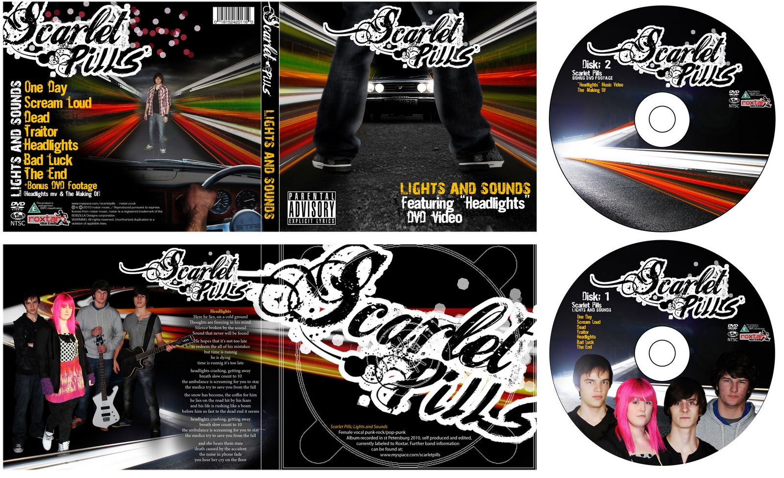 Techniques similar to these were then used to complete the following panels of the product, disks and advert. Overall I feel this resulted in an extremely professional and successful product involving a range of processes all designed to benefit the aesthetics in relation to suitability for both audience and genre.
No comments:
Post a Comment